I love Netvibes, and I also love and use many Google free services, so I was troubled when I had to make the choice between the two as they basically offer the same functionality. After some tinkering with both, I've easily switched to Netvibes because it's, simply, better. Here's why
1. Nicer looking interface
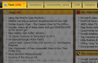
Possibly not the most important of features to some u, but just look at beautiful Netvibes boxes compared to Google's bland ones. Also, you can change their color (you have 6 colors to choose from) by clicking "edit" in the upper right corner.
2. Visual Customization
 Google Homepage is designed to simply work without much hassle. However, if you're a customization freak like me, you'll love Netvibes' advanced options. First, get the Netvibes Customize module here. You can now set a background wallpaper for your page, set opacity options for your modules, plus some other minor options. Better yet, you can change this stuff all at once, using themes (there are a few available under Settings).
 3. Number of Columns
In Google Homepage you're doomed to use a maximum three columns. However, in Netvibes you can change the number of columns from 1 to 4. Personally, I use 4 columns and I certainly think people with bigger screens and resolutions will appreciate the extra column. Better yet, you can change the number of columns for each tab, which is explained in...
4. Tabs
Yes, Google Homepage also supports tabs. However, in Netvibes they're much more advanced. Click the little arrow on the tab, and you get tab options. You can change the number of columns, add a little icon (you can even add your own icon by pointing to its URL), and you can publish this entire tab on the Netvibes Ecosystem. That means, if you create a super-duper tab showing all possible info on, for example, upcoming movies, you can simply share it with your friends and everyone else.
5. Netvibes ecosystem
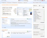
 And this brings us to the Netvibes Ecosystem, which really is more than a fancy name for a bunch of feeds. The Ecosystem consists of modules, feeds, podcasts, events and tabs. We've explained what tabs are, and you probably know what feeds and podcasts are. Modules are advanced little programs which can do almost anything - from showing the weather to displaying your bookmarks. Events are little calendar apps which show certain dates - basically, they're public Google calendars, but a nice thing to have. On top of all this, the Ecosystem is well organized, easy to browse and search, and from it you can add modules to your page with a single click.
 6. Filtering
One of the new Netvibes features is filtering. It works simple - you have a little text box on the top of your screen. Type a keyword, and all modules not containing the keyword will shrink, while those that do contain the word will have it highlighted. Nice, fast, and handy.
7. Digital Life Assistants
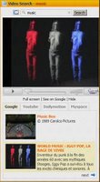
 Recently the Netvibes crew created a couple of new, advanced modules called Digital Life Assistants. Basically, these are search modules but with many convenient options - for example, video search with full screen viewing. Find more about these here.
 8. Keyboard controls
I don't personally use this (I find it hard to get used to keyboard shortcuts in general), but it might be handy for some users.
For this to work you need to enable it in Settings. Your focus also must be in the right place - click somewhere inside the Netvibes window before using keyboard shortcuts. You can find the list of all available shortcuts here.
9. Calendar
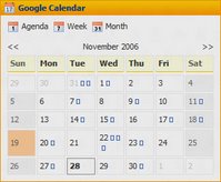
 This calendar module is just one module, but it's so much better done for Netvibes than the Gcal for Google. It has several views and generally looks much nicer, as you can see in the picture. It also supports everything in iCal format.
 10. Name for your page
Not really a dealbreaker, but it's nice to be able to see TechShrine or something cool like that above your page (it also appears in the page title). You guessed it - Netvibes can do it, Google can't.
*By the way, if you're interested in an alternative to Netvibes, you can always try Pageflakes, also a very nice service of the same kind.


6 Comments:
I almost agree on everything, but I still prefer Google Calendar...
I would also add
11. Neutral (I do not like that Googles reads my emails, my calendar, my searches, my blog, my maps ...
I liked your text and I added a discussion linking to it in the new Netvibes users Forum:
http://netvibes.7.forumer.com
You will find it here:
http://netvibes.7.forumer.com/viewtopic.php?p=21#21
Good work,
Opo
November 28, 2006 at 5:35:00 PM GMT+1
Thx, Opo. About neutrality, well, I still use a number of other Google services, including Blogger, so I guess I trust them (;
November 28, 2006 at 5:43:00 PM GMT+1
Webwag launches a new release on Thursday, you'll be able to compare.
November 28, 2006 at 9:42:00 PM GMT+1
Thx, Webwag is a new one for me, I'll write something about the service after I check it out.
November 28, 2006 at 10:07:00 PM GMT+1
Webwag is a joke guys ... ;-) keep running on Netvibes !
November 28, 2006 at 11:52:00 PM GMT+1
don't know what makes netvibes better than pageflakes. if you ever tried pageflakes you'd know that it is far superior with all it's social (sharing) functions.
ellen
November 29, 2006 at 12:57:00 AM GMT+1
Post a Comment
<< Home | Digg! | Reddit! | Netscape! | del.icio.us! | Stumble!