<meta name='google-adsense-platform-account' content='ca-host-pub-1556223355139109'/> <meta name='google-adsense-platform-domain' content='blogspot.com'/> <!-- --><style type="text/css">@import url(https://www.blogger.com/static/v1/v-css/navbar/3334278262-classic.css); div.b-mobile {display:none;} </style> </head><body><script type="text/javascript"> function setAttributeOnload(object, attribute, val) { if(window.addEventListener) { window.addEventListener('load', function(){ object[attribute] = val; }, false); } else { window.attachEvent('onload', function(){ object[attribute] = val; }); } } </script> <div id="navbar-iframe-container"></div> <script type="text/javascript" src="https://apis.google.com/js/platform.js"></script> <script type="text/javascript"> gapi.load("gapi.iframes:gapi.iframes.style.bubble", function() { if (gapi.iframes && gapi.iframes.getContext) { gapi.iframes.getContext().openChild({ url: 'https://www.blogger.com/navbar/538546064539074062?origin\x3dhttp://franticindustries.blogspot.com', where: document.getElementById("navbar-iframe-container"), id: "navbar-iframe", messageHandlersFilter: gapi.iframes.CROSS_ORIGIN_IFRAMES_FILTER, messageHandlers: { 'blogger-ping': function() {} } }); } }); </script>
| Sunday, December 17, 2006

Notice: You are viewing a post on my old site. Click here to go to the new site.

The transfer of this site to franticindustries.com is now complete. The switch to Wordpress has been relatively painless, and almost all of the content has been transfered to the new site - except the comments, sorry.

The RSS feed should be automatically transfered to the new location.

Please point your bookmarks to the new site, as this site will no longer be updated. Thank you.


Read entire post! | Digg! | Reddit! | del.icio.us! | Stumble!

0 comments | Friday, December 15, 2006

Notice: You are viewing a post on my old site. Click here to go to the new site.

Microsoft.com received a complete redesign, featuring lots of unused space and less clutter (that's good), no tables (that's also good), and, most importantly, a menu that gives you quick access to all Microsoft products and services.

Microsoft's pages have mostly been hell in the last couple of years. The homepage itself wasn't bad, but god help you if you tried actually finding some precise info about a Microsoft product or service.

Since Microsoft's pages are a never ending jungle of tutorials, help articles, technological explanations, updates and whatnot, I don't reckon they've actually managed to set all that in order. But, at least the new home page is clean and pretty. And, they've added a menu which at least points you in the right (general) direction - on the upper right side of the page you know choose between "Products and related technologies", "Downloads and trials", Using Microsoft products", "Security and Updates", "Training and events", "Support" and "About Microsoft". Click on "Products" and you actually get info on all Microsoft products in one place. Well, almost - each link leads you to a part of the old Microsoft site, but at least it's all there in one place. Finally - less confusion, less noise, more actual info.

Labels: , ,


Read entire post! | Digg! | Reddit! | del.icio.us! | Stumble!

0 comments

Notice: You are viewing a post on my old site. Click here to go to the new site.

There aren't many sites big enough that they can say something like "iPhone will be launched on monday. It's completely different than what we expected" and have people actually pay attention. Gizmodo is one of them, and since they can't afford being dead wrong on news like this, I guess we'll all have to believe them.

As far as iPhone hype goes, I never rode the bandwagon. The cell phone market is a completely different beast than the MP3 player market, and same rules do not apply here.

Although (for some strange reason) none of Apple's competitors in the multimedia player market managed to create an equally intuitive user interface, when it comes to cell phone UIs, Nokia, Sony Ericsson and others call the shots - and people who use cell phones - and that's pretty much all people - are used to their UIs. So, fancy touchwheels won't be much help here.

Furthermore, while iPod is popular all over the world, Apple is strong only in the US. Here's an example. In Croatia, where I live, I reckon 3 out of 10 people on the street would know what an iPod is, but maybe 1 in 20 would know what Apple or a Mac is and what they do. On the other hand, they all know what Nokia is. Croatian market is a small one, but this is indicative for all other eastern-european countries. So, I reckon, while it may not be the case in the US, that the rest of the world might react to the news of iPhone rather mildly.

There are also those pesky things called mobile operators, which kinda own much of the cell phone market right now. Apple has to reach an agreement with them, because if they don't support the iPhone, including it in their device+subscription cheap bundles, it will be a lot harder for iPhone to get wide acceptance.

If you ask me, the multimedia-player-meets-cell-phone functionality is where Apple needs to make a breakthrough. Althouth all big cell phone manufacturers have multimedia capabilities in their products, none of them has been able to really nail it down perfectly yet. Photo functionality? Sure. Video recording? Yes. Occasional MP3 listening/video playing? Well, sometimes, but not really. If iPhone manages to offer a good cell phone with great multimedia player capabilities (and I mean great, not just good enough), it might have a chance of a big worldwide impact.

All this said, let's wait for monday and see if Gizmodo was right about the launch in the first place.

Labels: , , ,


Read entire post! | Digg! | Reddit! | del.icio.us! | Stumble!

0 comments

Notice: You are viewing a post on my old site. Click here to go to the new site.

Adobe has released a beta version of Photoshop CS3, sporting some interesting changes, most notably the one-column toolbar.

Photoshop CS3 beta is shippped with a a pre-release version of a major upgrade to Adobe Bridge, and a new tool integrated in CS3 called Adobe Device Central, which enables you to optimize your content for devices with smaller screens.

If you want to give CS3 beta a test run, you need a serial number from either Adobe Photoshop CS2, Adobe Creative Suite® 2, Adobe Creative Suite Production Studio, Adobe Design Bundle, Adobe Web Bundle or Adobe Video Bundle, and you can download Adobe Photoshop CS3 here.

I haven't gotten my hands on CS3 just yet, but you can read a review of the new features in this article. The most interesting change seems to be the new user interface with the all-new one-column toolbar, which - luckily for people that don't like change in their life - can be reverted to the standard two-column version. I'm also quite excited about the new Quick Select Tool, which makes selecting objects from a background much easier.

Labels: , , ,


Read entire post! | Digg! | Reddit! | del.icio.us! | Stumble!

0 comments

Notice: You are viewing a post on my old site. Click here to go to the new site.

Nintendo decided to recall all of the hand straps delivered with their Wii console because of user complaints that the strap simply isn't strong enough.


I hope this news doesn't spur as much controversy as the Sony battery recall, because it simply isn't worth it. Nintendo weighed the options they have, and they decided that the best thing to do is to recall the straps and replace them with better ones. Good move.

According to Nintendo, the recall will not cause a big financial loss for them.

Labels: , ,


Read entire post! | Digg! | Reddit! | del.icio.us! | Stumble!

0 comments

Notice: You are viewing a post on my old site. Click here to go to the new site.

There's no sense postponing the inevitable. After a month-long experimental phase, franticindustries is moving to its own server and web domain - www.franticindustries.com. Don't go there just yet - there's nothing on at the moment. The move will be done on Saturday/Sunday, so don't expect too many updates over that period.

Hopefully, all the links to articles on franticindustries.blogspot.com will be redirected to the new domain. The RSS feed at feeds.feedburner.com/Franticindustries should also automatically start pointing to the new website.

In case of any bugs, or weird behaviour of the site, don't hesitate to contact me at franticindustries@gmail.com.

Labels: ,


Read entire post! | Digg! | Reddit! | del.icio.us! | Stumble!

0 comments | Thursday, December 14, 2006

Notice: You are viewing a post on my old site. Click here to go to the new site.

New service from Google lets you search the entire text of the U.S. patent corpus (that's over 7 million patents), together with images.

Google Patent search lets you search by criteria - patent number, inventor, and filing date. It is similar to Google Book Search, which means that you can scroll through pages and zoom in on the text and images.

I've tried it out and got several server-not-responding errors, which were probably just coincidence. Other than that, it works fine, and will surely be an invaluable resource to all those folks who think that immeasurable wealth is just one patent away. I've immediately tried searching for a "Car seat with integrated side light", and - damn! - it already exists. So much for my dreams of wealth and glory.

Labels: , , ,


Read entire post! | Digg! | Reddit! | del.icio.us! | Stumble!

0 comments

Notice: You are viewing a post on my old site. Click here to go to the new site.

Techcrunch UK, the United Kingdom + Ireland arm of the popular Web 2.0 blogging authority Techcrunch, has been put on hold and its editor, Sam Sethi, is fired by Mike Arrington, the owner of all things Crunch.

Problems arose from Sam Sethi's negative (and kind of half-assed, if I may add) comment on the Le Web3 conference, which spurred some insults from the conference organizer Loic Le Meur. Sethi fired back by trying to make Loic look like a jerk in front of everyone, although Loic had apologized, and Mike had specifically asked Sam not to do that. So, Sam gets fired. It's basically your standard editorial stuff, happens every day in journalism. You can read Mike's account of the whole incident here.

This will all be very well covered by, well, everyone, so I hope you'll forgive me if I give a bit of a personal commentary myself.

I'm not saying that Mike was wrong or right, but this type of thing is exactly why blogs should never become big business. When you have one guy behind the computer, working on his blog, then his only concern is quality of content. On the other hand, when you have ten or more websites, dozens of people working for you, conference organizers calling you because they didn't like your post, and, ultimately, hundreds of blogs writing about your decision to fire someone, then you're no longer a blog; you're a business, and we all know that business don't only think about quality of content.

This is not to be taken as an attack on Techcrunch or Mike Arrington; it's just my view on the advantages simple blogs have over traditional journalism. Working professionally in IT journalism for over three years, I very well know that you have to compromise all the time. You're doing a laptop test? If you say (it's just an example) that all Toshiba laptops are crap, Toshiba won't advertise with you any more. It's what happens - it's reality in IT journalism. That's why people write blogs, that's why people READ blogs. Because bloggers can truly write what they really think.

Looking back at Sam Sethi's comment on the Le Web3 conference, from a professional, IT journalist point of view - it's bad. It's short, it's not really objective, it makes things look worse than they are (The wifi for the event did not work and this has annoyed many people - that's your main argument for the whole event being horrible?). But from a blogger's point of view, it's perfectly OK. The guy came to the conference, it was boring, Wi-Fi didn't work, soda was warm, whatever.

So, even if Mike Arrington doesn't consider himself to be a pro journalist, firing Sam was a real pro journalist move he had to make. Welcome to the club.

Labels: , , ,


Read entire post! | Digg! | Reddit! | del.icio.us! | Stumble!

0 comments | Wednesday, December 13, 2006

Notice: You are viewing a post on my old site. Click here to go to the new site.

Google has announced the release of the beta 3 version of Google Toolbar for Firefox, which sports some really interesting options.

Among other things, the new Google toolbar lets you share pages via Blogger, Gmail and SMS, and add custom buttons to your Toolbar, and share web pages via Blogger, Gmail, and SMS.

But the most important feature which might make me a user (I'm not a big fan of any extra toolbars in Firefox because they take away my precious screen space, so I don't use Google Toolbar) is this: it now lets you access your bookmarks from any computer. Finally, an end to the torments of having two different sets of bookmarks at work and at home.

Get Google Toolbar here.

Labels: , , ,


Read entire post! | Digg! | Reddit! | del.icio.us! | Stumble!

7 comments | Tuesday, December 12, 2006

Notice: You are viewing a post on my old site. Click here to go to the new site.

New social content websites are appearing every day, but I don't see any of them gaining a really big following. I've done a little research to find if there is a secret ingredient that can make a new social content website successful.

If you've compare the traffic of the big 5 social news sites - Digg, Reddit, Care2, Netscape and Shoutwire, like I did in my Top 5 social news sites roundup, you can see that the top 2 are growing. Care2 seems to be slowly losing momentum, Netscape's real quality traffic is indistinguishable from the huge amount of traffic they get on their name alone, while Shoutwire seems to stall (and if they keep having 2-3 days old articles on the front page, they'll probably start plummeting pretty soon).

But what about the newcomers? Are there still some cookies left for them, or have the big ones scooped the entire bowl, leaving only scraps for the little sites? Unfortunately, it seems so.

As you can see by this fantastic list over at 3Spots, there's more than enough new social content services around, and new ones are probably being created every day. But a quick Alexa check shows that not only are most of these sites poorly visited (which isn't that surprising, given that they're, well, new), but their traffic doesn't have a strong tendency of going up - it mostly just stalls with occasional peaks when news of these sites appear on Digg or some other big site.

Still, careful examination of these sites can give us some valuable info on what works and what doesn't in the social news arena.

First of all, let's divide these sites into some broad categories so we can notice the trends easier. Bear in mind that, for simplicity's sake, I'm leaving out many new somewhat similar services like Spotback, Megite, or Tailrank, and focusing only on the more or less "standard" social content websites.

1. English Digg-like social news sites. This means sites which cover a broad range of categories, and are in concept similar to Digg, with standard browse-submit-vote-comment functionality. This includes Pligg sites, which aren't that much different from Digg, but tend to be similar between each other.
2. English specific social news sites. These are sites with functionality similar to Digg, but instead of covering all possible topics, they focus on one category.
3. Non-English social news sites. From Meneame to Fresqui.com, these are the sites that cater to the social news needs in a language other than English.

I've extracted the Alexa traffic data for all of the sites on 3spots list (yes, all of them), and I've compiled a list of top 5 sites for these three categories. (*I've excluded pornography sites, because I their rate of success probably depends on vastly different factors than other sites. I've also excluded the five big sites I've covered in my recent article.).

In the first category, the list is:

1. Newsvine.com - traffic stalling
2. Blinkbits.com - medium growth
3. Hubpages.com - medium growth
4. Thebeststuffintheworld.com - medium growth
5. Wikio.com - slow growth


The second category looks like this:

1. Flurl.com - theme: videos, slow fall
2. QJ.net - theme: gaming, slow growth
3. Dzone.com - theme: developers, medium growth
4. Bestweekever.tv/ble/ - theme: TV, slow growth
5. Bad.webpagesthatsuck.com - theme: bad web sites, medium growth


NB: at this point between 50 and 100 in Alexa's charts you can find as much as 50 new topic-specific social content websites. I'll name some of the ones that are doing well: dogster.com, videosift.com, indianpad.com, blosker.com, dealigg.com.

In the third category, instead of making a top list I decided to just randomly pull out some of the big growers, as it is difficult to me to discern which of these sites get most of their traffic from the social news component and which get it from completely different sources (btw, the obvious winner is Meneame.net):

- Meneame.net - fast growth
- Fresqui.com - fast growth
- Fuzz.fr - slow growth
- Overmundo.com.br - medium growth
- Mywowo.com - traffic stalling
- Wykop.pl - slow growth


So, what have we learned from this exercise? The top 5 lists might not show all that much, but sifting through all of the websites I've learned a lot.

1. There is no viral growth. If you make a social news website, do not expect exponential growth or a boom of new users overnight. Like any other website, the users you get are the users interested in your topic(s), they will only stick if you have quality content, and you have to fight for every one of them.

2. Growth is hard to come by at all. Of all the sites mentioned here, only about a third is actually growing at a noticeable rate. Moreover, huge spikes (probably from Digg or Slashdot traffic) didn't help them at all, the traffic almost universally goes back to the same volume as before the spike.

2a. Non-English websites are the only ones that are universally experiencing growth.

3. Specific topics don't do much better than general topics. This came as a huge surprise to me, as I was pretty certain I'll see a pattern of growth amongst websites that cover specific topics. But, lo and behold, there aren't many that made it big. However, there's definitely more specific-topic sites appearing, and they have a tendency to grow - up to a point. My conclusion here is this: if you have a big web portal or a service behind you with an established community and lots of traffic, you might do well with a site that covers a broad area of interest. If you're a startup, go with a very specific topic.

3a. Technology news are not dominating, nor is any other specific topic.

4. Websites in other languages do much better than English-based websites. However, I think that this is simply due to language barrier winning over Digg. It means that non-English users, if given an alternative, will rather use a good Digg clone in their own language than Digg itself. Consequences of this are easy to predict: if a country doesn't have its own Digg yet, go ahead and make one; you'll do well. But if a good Digg-like site exists and has at least decent traffic already, then it's the same as fighting against Digg itself.

4b. Social news sites are most popular among the Spanish, Chinese, and Japanese population.

5. Technology, design and approach DO matter. Sites that are more technologically advanced, better designed, or have an original approach, tend to do better than run-of-the-mill Digg clones. Examples of this are Newsvine, and thebeststuffintheworld.com. This might seem natural, but on the Internet design and technology often yield to virality and content; just remember MySpace.

Conclusion:

The prospect for upcoming social news websites is grim. It seems that it takes a combination of an interesting specific topic, great design and functionality, and an original approach to achieve at least moderate popularity. And even then there's a chance your website will just stall at the same traffic volume for months, and maybe years, before it finally shuts down. There's still some room for growth if your website is non-english and/or covering a specific geographic area. Of course, I cannot rule out that some ingenious site will show up and take the world by storm, but from what I've seen in this research, none of the newcomers show signs of greatness.

The way I see it, the concept of social content websites does not work on its own - except in rare cases of Digg and Reddit. It's a great addition to a website that already has good content, or plans to build good content in the future, but it's definitely not driving growth by itself. For now, the Digg effect seems to be reserved for Digg only; the future lies somewhere else.

*Disclaimer: the data used for the comparisons in this article are taken from Alexa and need not be correct or exact. Furthermore, I did not use any exact statistical means of comparing data; all comparisons in the article are my own interpretation of Alexa's data and many other individual factors.

Labels: , , , ,


Read entire post! | Digg! | Reddit! | del.icio.us! | Stumble!

2 comments

Notice: You are viewing a post on my old site. Click here to go to the new site.

A social news service was launched today at Wikio.com (together with versions for Spain and Germany at Wikio.es and Wikio.de). Wikio was already live and quite active in France and Italy, where they have around 700.000 users altogether. I tried out the service and while I can't say it's bad, it failed to really impress me.

Social news (if you're wondering, I've changed my terminology from community news to social news. It relates better to social networking and social bookmarking) sites cannot succed with the "standard" design and the "standard" features anymore - unless they have a lot of traffic from another source already, like Netscape and Care2.

I've tried out what Wikio has to offer, and I have to conclude it's just that - a standard, run-of-the-mill social news sites. It's not bad by any means (although I have found bugs really quick, more on that later), but it doesn't offer anything really new.

So, a quick rundown of the features:
- you have the standard post, browse, submit, comment functions. Not many news here, except the fact that you can use a bit of advanced formatting in your descriptions, like bold, italic, font color, paragraph positioning etc.
- There are editors, so it's not all completely society-driven. However, the editors aren't really visible as in Netscape.
- no e-mail registration is required to post.
- there are 14 available categories, items are colored according to the category - nice touch.
- tags are also available, which is good. You can browse articles via a tag cloud on the front page
- if you sign in, you have a personalizable page, but there isn't really much you can do here except write some text.

Those were the good points, let's go over the bugs:

- "lastest contributions" should probable be "latest contributions"
- while browsing through latest contributions, you can't choose just one category to browse, which is annoying
- if an article you're trying to publish is already published, you get a message "An article has already been written on this news item. Do you want to comment this article?". First, I'd like to see the article immediately, so I can compare it with mine. Secondly, when you do try to click on "comment this article", you get a HTTP Status 500 error.

All in all, these minor bugs will probably soon be ironed, and they're not the main problem of the service. Wikio's biggest problem is that it simply doesn't offer enough novelty to separate itself from many other similar sites. What it does it does relatively well, but there are other, bigger sites that do it better. Furthermore, it has a broad, general scope, with standard categories, which will probably make it harder for them to create a solid and devoted user-base. Wikio.com will probably drive some traffic from its international sites, but will it be enough to make an impact? We'll see.

Labels: , , , ,


Read entire post! | Digg! | Reddit! | del.icio.us! | Stumble!

0 comments

Notice: You are viewing a post on my old site. Click here to go to the new site.

Google blatantly stole a design template from Yahoo for their get IE7 campaign. It wouldn't be a big deal if they had just used Microsoft's template, but it's pretty obvious that they actually stole from Yahoo. Matt Cutts of Google apologizes to Yahoo's designer team, but doesn't forget to point out how Yahoo copied their AdSense template.

To be honest, the fact that big G stole a design for the promotion of a third party product would hardly be newsworthy, but the fact that their design actually has Yahoo's recognizable 'Y' all over it, and badly erased in Photoshop, makes it funny (and worth firing the guy/girl who did it).

What Matt points out about Yahoo stealing their AdSense template, is actually far more important, since this is their original product that makes money. But, it's a little too late to be digging through old design mistakes now; Google will have to take some public beating for their dumb move, and will probably make sure stuff like that doesn't happen again.

Labels: , , , ,


Read entire post! | Digg! | Reddit! | del.icio.us! | Stumble!

0 comments

Notice: You are viewing a post on my old site. Click here to go to the new site.

It's no big secret that I'm not really a fan of iPod Shuffle, because to me the absence a feature (in this case, the display) isn't really an advantage. However, if you're gonna do it, at least make it look nice. Apple has done it with its Shuffle, and now iRiver announced S7, a nice little piece of MP3 art.

As far as features go, iRiver S7 connects to the computer via USB 2.0, supports MP3, WMA, ASF and OGG Q10 formats, and it also sports an FM tuner.

Its front side consists entirely of control buttons, and the whole thing is just 30mm long and 9.6mm thick. More pictures at iRiver site.

Labels: , ,


Read entire post! | Digg! | Reddit! | del.icio.us! | Stumble!

0 comments | Monday, December 11, 2006

Notice: You are viewing a post on my old site. Click here to go to the new site.

New York Times stories now include links that enable users to submit them to community news services, in this case Digg, Newsvine and Facebook.

Seems that even the biggest and the most "traditional" are yielding to the trend of increasing exposure through community news services. Sites like ZDnet and The Register already have them, and now New York Times has also joined in.

However, for some weird reason, they decided not to make direct links to Digg, Newsvine and Facebook but to use popups instead, which will surely annoy many users.

According to this report, NYTimes did this mostly to keep the pace with new trends, but I think that they also realized that additional traffic surely can't hurt them.

Labels: , , , ,


Read entire post! | Digg! | Reddit! | del.icio.us! | Stumble!

0 comments

Notice: You are viewing a post on my old site. Click here to go to the new site.

Innovations in the field of USB/firewire hubs aren't really that common, but LaCie thinks different. Their LaCie Huby is one hub you simply have to see.


This gadget is available for quite some time, but I've just noticed it now. LaCie Huby has 4 USB 2.0 ports & 2 FireWire 400 ports, a USB fan, a USB light, a USB extension cable and a FireWire 400 extension cable. Furthermore, it has different-colored lights which light up as you connect devices to the ports.

It looks like...well, just check out the picture. I'm sure it's at least partly aimed at Mac users who will appreciate the clear white lines and the overall coolness of the product.

The price, though, is pretty steep for this type of device - $79.99. You can find the full specifications over at LaCie's site.

Labels: , ,


Read entire post! | Digg! | Reddit! | del.icio.us! | Stumble!

0 comments

Notice: You are viewing a post on my old site. Click here to go to the new site.

A report commissioned by Microsoft and created by IDC claims that Vista will create 157.000 new jobs in the IT industry and generate $70 billion of revenue.

Basically, what IDC claims to have done here, is compare their standard prediction of IT growth in 2007 and then compare that to their prediction of Vista's impact on the IT market, which they call the "Vista effect".

Among other things, the report claims the following:

- that 60% of growth in Windows-related employment will be driven directly with Windows Vista, which approximates to over 100.000 new jobs (1% of 10.3 million currently employed in the IT industry
- that every dollar of Windows Vista-related revenue Microsoft in 2007 translates to $18 dollars for the entire Windows-related IT industry, which means $70 in revenues

Although IDC clearly states that it has taken into account the growth IT market would achieve without Vista, I'm still not convinced that these numbers have much to do with Vista. The simple fact that there is a new Windows OS coming is what creates these numbers; it has nothing to do with the quality or any feature of the OS itself.

Full report here.

Labels: , , ,


Read entire post! | Digg! | Reddit! | del.icio.us! | Stumble!

0 comments

Notice: You are viewing a post on my old site. Click here to go to the new site.

Every time I see one of Vista's "gadgets" it reminds me of a bad naming decision by Microsoft.

This is not really anything new, but I have to say it: Microsoft's decision to name small specialized desktop applications that show up on Vista's desktop (or Windows Live) "Microsoft Gadgets" is poor for at least two reasons.

1. Everyone else calls these types of applications "widgets". Yahoo's Konfabulator and Apple call it that, why couldn't Microsoft simply adopt the name? They didn't invent anything new, it's the same thing. If copyright issues were involved, they could have invented some variation of the word, or a completely new word - it's what all the new web 2.0 companies do.

2. The word "gadget" already has a widespread meaning in the IT world - an often small mechanical or electronic device with a practical use. Using that name for something completely different only causes confusion.

It's not the end of the world, but it's annoying, it's confusing, and - most importantly - when two different things have the same name, it's harder to distinguish among them when you use search engines. Lesson to software developers: don't try to take over the word.

Labels: ,


Read entire post! | Digg! | Reddit! | del.icio.us! | Stumble!

2 comments | Sunday, December 10, 2006

Notice: You are viewing a post on my old site. Click here to go to the new site.

Gmail introduced a new feature called Mail Fetcher, which lets you read mail from other accounts in Gmail. It's a great feature, and Gmail has already been declared perfect because of it, but let's not get too enthusiastic yet

This great new feature (currently available to only a small fraction of Gmail users) enables you to use only Gmail for all your e-mail purposes, which is great. Gmail, which is in my opinion already the best web-based e-mail client, just got a little better.

However, I don't think it's time to call it 'perfect' yet. It's a great service, but as an e-mail client it's far from the best. I use Ritlabs' The Bat, a sometimes quirky and moderately buggy e-mail client, but also the most powerful client out there.

While Gmail is good and simple to use, The Bat! has at least 50 features that Gmail doesn't. Instead of listing them all here, I'll just name a couple I really use:

- Threaded view. You can set your view to be threaded with sender's address being the thread anchor, which makes your e-mail infinitely more organized and less cluttered than in standard view. Since i receive a lot of email, this feature is invaluable to me.

- Different passwords for different accounts. A minor feature that I use in the following way - I have some simple password for my business accounts, which I share with some of my colleagues, so they can read it on my computer when I'm not in the office. On my private accounts, I have a different password.

- Fine tuning of your spam filter. Gmail's spam filter is nice, but you can't really fine tune it as you can in The Bat!

The list goes on. As I've said, Gmail is great, it offers a lot, and maybe in time it will render all desktop e-mail applications obsolete. But not yet.

Labels: , ,


Read entire post! | Digg! | Reddit! | del.icio.us! | Stumble!

0 comments

Notice: You are viewing a post on my old site. Click here to go to the new site.

When it comes to mobile phones, I've seen many innovations that will probably be forgotten in history as just another curiosity, but this one is one of the most bizarre - a cell phone with a dual LCD screen

Credit for this invention goes to Seok Hong Jeong, who revealed this weird-looking device at the Seoul International Invention Fair 2006.

The phone does give you a lot of screen estate, but at the cost of looking pretty clumsy. Since mobile phone manufacturers are always desperate for a larger screen, this might look like a good idea, however it seems to me like a kind of device that would perhaps sell only in the innovation-hungry market of the far east.

The device was spotted at the Fair by Aving.

Labels: , ,


Read entire post! | Digg! | Reddit! | del.icio.us! | Stumble!

0 comments

Notice: You are viewing a post on my old site. Click here to go to the new site.

Like many seasoned web surfers, I too barely notice pleas for donations on websites, even those I've frequented for years. Strangely enough, in the last couple of days several websites have attracted my attention with their donation request. Here's what they've done right

Just to clarify, I do not at this time ask for any donations, nor have I ever done it before, so this text comes strictly from a user perspective. When you browse literally hundreds of websites daily, like I do, ads and donation requests that you actually notice must be doing something right.

1. Cuteness and good intentions


It may not seem like much at first, but Abandonia's donation link on the upper right side of the page seems like a perfect donation request to me. Abandonia is a site devoted to freely distributing abandonware games, so the cute pixel character hits the mark perfectly. It's subtly animated to drag your attention to it. It's practically begging for money, however it doesn't come of as cheesy because it fits into the site perfectly. Lastly, when you do click it, you see that the authors are spending all donated money only for web hosting costs, and if they raise more than they need, they give everything back to the users as prizes in various contests. I don't know how much donations they receive, but if this doesn't work, I don't know what does.

2. Be precise, make a progress bar.


When I work, I mostly listen to chillout/downtempo music for relaxation. One of my favorite web radio stations is www.lounge-radio.com, which is more or less completely donation-driven. Since they reached their donations goal for 2007 they changed the donation page to a thank you page, but I'm going to describe what it consisted of. It was a detailed explanation of how much money they exactly (down to the dollar) need, and what they will spend it for. They've made it perfectly clear that the site will cease to function if they don't get that sum until the end of 2006. They've made a progress bar, showing how much funds they've raised so far. And lastly, they included a list (which is still visible) of all donors. Needless to say, they easily got the required sum of money, which will enable them to keep on lounging for one more year.

3. No ads, only donations.

DropBoks, a simple free online file repository service, simplifies things to the extreme. They have no ads, the design of the site is very minimal. They make it clear through a small, unobtrusive yet visible button on the bottom of the page that the site is donation-driven, which enables them to have no ads whatsoever. So far, it works for them.

4. Be completely honest about everything.

Kottke.org, one of the most famous blogs on the net, currently has no ads and asks for no donations. However, when he needed donations, Jason Kottke wrote a very detailed post explaining exactly what he asks for and why he does it, going into somewhat personal details of his life and work. And it worked fantastic; the response was overwhelming.

5. Ask for something specific and important to your audience

This particular donation wasn't completely successful, but I still think it was a great way to attract attention and to communicate directly with your fans. Scott Kurtz, the guy who draws the comic at PVPonline, was constantly bombarded with fan-mail from Mac users who thought it would be cool if he bought a Mac. In this post, he asked them to put their money where their mouth is, asking for just one dollar from each visitor, which would be spent by him to buy various Apple hardware. He even included a cool progress bar showing how far had he got - as you can see, he barely made it to a 15'' Mac. Not perfect, but not bad also.

Labels: , ,


Read entire post! | Digg! | Reddit! | del.icio.us! | Stumble!

0 comments

Notice: You are viewing a post on my old site. Click here to go to the new site.

When something is really simple to use, it stands out. The folks over at DropBoks know this, so they've made their online file storage service as simple as it can possibly be.

When you open the site, you're greeted with a window which shows the contents of your online folder. Sign up, and you can upload your files from any computer connected to the net. It's fast, it's simple, and it works.

The total size of your files must not exceed 1 GB, while an individual file can be as large as 50 MB. This pretty much sums up all that can be said about this little service, and I wouldn't want it any other way. I reckon the size limits might increase in the future, but the service is really new - give it time.

What's better, the site doesn't have any ads - it is funded entirely through donations. According to Luke, the site founder, this funding model is so far working well. This doesn't surprise me, because when there aren't annoying 'YOU WON' flashing banners, people probably feel more inclined to click that 'donate' button.


www.dropboks.com


Labels: ,


Read entire post! | Digg! | Reddit! | del.icio.us! | Stumble!

0 comments | Saturday, December 9, 2006

Notice: You are viewing a post on my old site. Click here to go to the new site.

Franticindustries has had another redesign, I hope you like it. It's 98% done, expect some minor quirks, especially if you use IE6 or earlier.

The simplicity of the Blogger template makes me constantly want to redesign everything, but I think I'm now close to the final version that will serve the site for at least several months.

To make all this work the way it does, I've done a lot of different hacks, both for Blogger and to display stuff correctly in IE6. If you want to know how I did something on the site, don't hesitate to ask. And, if you like the site, by all means do send us words of praise (:

Labels: , , ,


Read entire post! | Digg! | Reddit! | del.icio.us! | Stumble!

0 comments | Friday, December 8, 2006

Notice: You are viewing a post on my old site. Click here to go to the new site.

An interesting discussion is hot these days about top diggers getting paid to Digg someone's story. Kevin Rose stated clearly that "Diggers will never get paid" because it would create an inequality among those that do get paid and those who do it for free. I offer a solution: give the Diggers some of Digg's traffic.

It's obvious that many Diggers consider they should have some benefit from their hard work (and it is hard work; just try and get 20% of your stories promoted to the front page and you'll see).

What I propose is very simple: instead of the line:

submitted by XXX 2 days ago (via xxx.com)

put the line

submitted by XXX (website: XXX.com) 2 days ago (via xxx.com)

Or, even more simple, make the submitter's name a link to his website, not his profile.

This way, Diggers would get some amount of traffic from their submission, which they can use as they please. The top Diggers - the ones who put in the most effort and have most stories promoted to front page - would receive more, in proportion, than Digg beginners; but that's only fair.

What's important to say here is that this traffic wouldn't make anyone a millionaire. People will still click on the story in 99.999% of cases. But, if you're good enough, you're going to get a few hits by Diggers who will undoubtedly be interested in your success.


Labels: , , ,


Read entire post! | Digg! | Reddit! | del.icio.us! | Stumble!

0 comments

Notice: You are viewing a post on my old site. Click here to go to the new site.

After a long and painful wait, Wii is finally available here in Croatia. And would I be a respectable geek if I didn't try it out immediately? Of course not
The only games available at the moment are the ones you get with the Wii - Golf, Baseball, Boxing, Tennis and Bowling.

I didn't actually play the games to finish them, I've just tried them all out to get the feel of the controller, and I must say that I'm impressed with its responsiveness. You can especially see that while playing Boxing - every movement you make is correctly registered by the Wii, and you actually have to hold your hands up to protect yourself.

I can understand why they initally wanted to call it Revolution - it definitely will revolutionize gaming as we know it. Can't wait to try out Zelda, which should be available soon.

Labels: , ,


Read entire post! | Digg! | Reddit! | del.icio.us! | Stumble!

0 comments

Notice: You are viewing a post on my old site. Click here to go to the new site.

More and more journalists end up in jail for their work every day. There are currently 134 imprisoned journalists all over the world, 49 of which are bloggers and Internet journalists. Is blogging real journalism or not, you ask? Well, the jail is certainly real.

As reported by CPJ (Committee to Protect Journalists), 134 journalists all over the world are imprisoned because of their work, which is an increase of 9 since last year. What you would call "regular journalists" - print reporters, editors, and photographers are still the largest category with 67 cases of imprisonment, however, it's interesting that Internet journalists are now imprisoned in 49 cases, which is over one third of the overall number.

This means that, although some (especially the traditional media) still don't perceive bloggers and rogue journalists as real journalists, the absolutist governments and regimes definitely see them as a threat. On top of that, it's probably easier for them to imprison bloggers because the public outcry is far less than when a renowned journalist is jailed.

China, Cuba, Eritrea and Ethiopia lead on this sad list with 31, 24, 23, and 18 cases of imprisonment respectively. If you're wondering, US also made the list, with one journalist in detention at the infamous Guantanamo Bay. You can read about each of the cases in detail here.

Labels: , ,


Read entire post! | Digg! | Reddit! | del.icio.us! | Stumble!

0 comments

Notice: You are viewing a post on my old site. Click here to go to the new site.

It's time to start with the 'best of 2006' lists, and with all the good stuff happening in the hardware department lately, what better way to start with than with the ultimate dream machine for the year 2006.

Although I usually write mostly about Internet-related topics, I'm also a hardware enthusiast, tracking new stuff and its prices all the time. I always have a list of components for a budget machine and an ideal, no-holds-barred, I'm-really-really-rich kind of machine, so why not share it here? My approach is a bit different than that of most hardware sites, who usually just recommend the most expensive stuff. I also take great care to choose the most silent components - even if they don't crank out maximum power. With that said, let's start.

1. Case

Antec Nine Hundred. This new product by Antec distinguishes itself from the rest by including spots for 5 120 mm fans and an additional 200 mm monster fan on top of the case. All these fans can make your computer really cool if you crank them up, but they won't produce much more than a hum if you keep them at 5V. Ideal.


2. PSU


Seasonic S12 Energy+ 650W
. Judged by Silentpcreview to be the one of the quietest PSUs on the market, Seasonic's Energy line will give enough power to your hardware and still keep at whisper quiet levels. Some might complain that they want a stronger PSU, but from my experience, no computer today draws more than 500W power. A stronger PSU will just make more noise.


3. Motherboard

Asus Striker Extreme. Simply put, the most powerful and versatile platform today offers me little choice than to include it in this list. For a (long) list of all of its features go here. I chose Asus because of the heatpipe cooling design, most effective I've seen of all n680i implementations.


4. CPU

Intel Core 2 Extreme QX6700 2.66. Sure, you won't feel much difference between it and Core 2 Duo. But 4 cores are future-proof, and although I don't think that a quad-core CPU pays off at this moment, this is a dream computer, right? It's still quite cool and not nearly as power hungry as AMD's FX-70 (not to mention that you need two of those if you want 4 cores).


5.CPU cooler

Scythe Ninja PLUS Rev.B Scythe has positioned itself as one of the top manufacturers of high-end cooling equipment, and their latest cooler and its 12cm fan will keep your Core 2 Quad cool with a minimum of noise.


6.GPU

2xBFGTech GeForce 8800 GTX in SLI mode. Here the choice is easy, as noone disputes that 8800 GTX is currently the best GPU on the market. Why did we choose BFGTech? Well, this is supposed to be a silent computer, and BFGTech really went out of their way to please the enthusiast with this water-cooled version of 8800GTX. Personally, I don't use watercooling, but someone who does will appreciate the effort.


7.RAM

OCZ Dominator XMS2 2x2GB DDR I'm cheating a little on this one because 2GB Dominator modules are not yet available, but they should be by the end of the year. 4GB of RAM memory wouldn't make much of a difference compared to 2GB on WinXP, but in Vista you'll definitely notice it. OCZ's Dominator memory was used in many hardware benchmarks lately and it is generally accepted as one of the best modules available. They come with a cooling heatsink included.


8.Optical drive

Blu-Ray Sony BWU-100A Usually, I wouldn't give this much cash just to have a Blu-Ray reader. Especially if I were able to get a PS3, because I get a nice gaming console and a Blu-Ray reader for the same price. But in a dream machine, Blu-Ray is the logical choice.


9. Audio

M-Audio Audiophile 192. Most reviewers usually choose one of Creative's products here, but I'm going for the audio card for the true hi-fi enthusiast. It's not a sound card for professional use; it's just an affordable card that will produce really great sound from your PC. You can plug it into your receiver and it will sound good even on an expensive speaker system.


10. Speakers

Klipsch ProMedia Ultra 5.1 If you're not really into all that hi-fi stuff, but you still want a really good sound from your system, you won't go wrong with 5.1 system from Klipsch.


11. Screen

Samsung CX305T 30-inch LCD. With this model, Samsung positioned itself as the proud owner of the fastest 30-inch panel available, with just 6ms response time. Other characteristics are 2560x1600 resolution, contrast of 1000:1 and 400 cd/m2 brightness. And with those dual 8800GTX cards, you'll actually be able to play in this insane resolution without having to reduce the quality.

So, that's it: we have a real beast of a machine here, but also one that - if not overclocked - won't even make much noise. I hope someone has the money to actually buy all this stuff, because I know I don't. Cheers!

Labels: ,


Read entire post! | Digg! | Reddit! | del.icio.us! | Stumble!

0 comments | Thursday, December 7, 2006

Notice: You are viewing a post on my old site. Click here to go to the new site.

When Firefox 2.0 first came out, I was one of those who claimed that it basically didn't bring anything new. However, the more I work in it, the more I discover new features that are really useful. Here's one - Ctrl+Shift+T

I usually don't remember keyboard shortcuts, and I rarely use them. But this is one Firefox shortcut I made myself remember, because it turned out to be really useful. It's Ctrl+Shift+T, which opens the last tab you've closed. If you press it several times, it opens several last tabs you've closed, in the reverse order. It's basically an undo function for Firefox.

When you surf as much as I do, you often close tabs, just to remember that you forgot to check out the URL, or some detail, like a name or a number on the page you just closed. No problem - Ctrl+Shift+T, and it's back.

Labels: , , , ,


Read entire post! | Digg! | Reddit! | del.icio.us! | Stumble!

0 comments

Notice: You are viewing a post on my old site. Click here to go to the new site.

Dave Ryan, a radio host over at the KDWB station, promised to give a Playstation 3 to the whoever leaves their baby at the station for one whole day. Results? People calling and offering their babies like mad!

Well, OK, maybe not like mad, but at least 20 parents were willing to exchange their baby for a PS3, and one woman was ready to even leave the baby for several days.

What worries me, if these people are ready to leave their child in exchange for a PS3, what would they do for a Wii? "Yeah, just wrap it up. And the baby? What baby? Oh, that baby. Well, you can just keep it if you like!"

It's not Dave's first stunt of the sort. A couple of days ago, he dared listeners to do something crazy to win a PS3. The winner? Tattooed the sign PS3 on his leg - upside down.

You can find the video lips here and here, while the audio clip is here.

Labels: , ,


Read entire post! | Digg! | Reddit! | del.icio.us! | Stumble!

0 comments

Notice: You are viewing a post on my old site. Click here to go to the new site.

In the beginning, there was Digg. And it was good. But there's never too much of a good thing, right? I've dug out (no pun intended) the 5 strongest community news sites and compared them according to their features, design & usability, and quality of content.

First of all, let me say that this was supposed to be a top 10 article. However, the biggest 5 community news sites - Digg, Reddit, Care2, Shoutwire, Netscape are so far ahead of the rest of the pack that there's no point adding any other service into the comparison. *let me just remind you that there are several other great news services but which do not work quite the same as the 5 I've mentioned, for example Sphere, Techmeme, Tailrank, and Crispynews, of which I've already written.

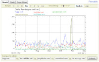
To illustrate this, in the following two pictures, you can see the traffic ranking for the big 5 and then another 5 smaller sites. However, since there are many nice and promising services out there, as you can see in this fantastic list on 3spots, I'll follow this article with a list of 5 most promising community news services.


So, here we go, in alphabetical order (grades are from 1 to 10):

1. Care2

a) Design & Usability


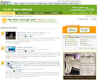
Care2 is not just a community news site. It sprung out from a large web portal focusing on health, human rights and protecting the environment. And, while the news part of the site is more or less independant, and covers different topics, the fact that it's all a part of something else shows, so the site lacks the clarity of Reddit or Digg. The design is professionally done, with two columns of news which turn into one column when you click on a category. The voting icons, which are here called "note it!" are visible enough, and most of the stories have pictures, which sets the site apart from its competitors. All in all, most people won't have trouble getting around the site, however, the other features of the portal do get in the way of the news part itself.

Grade: 6

b) Features

The basics - register, vote, comment, are here, but there are also some interesting additions. When you open the news archive, you can choose your channels like filters - for example, you can have all the Science & Technology and Offbeat news in one place, you can have just one category, or you can browse all 8 categories at the same time. Similarly (and at the same time) you can filter stories with more or less votes. Lastly, you can filter stories from this day, week, month and year. This is a solid concept which enables you to customize your channel almost exactly as you want it. Another feature is pictures next to users in the comments, which are bigger than at, for example, Digg. But, where Care2 really shines is the user profiles, which enable users to do a LOT. You've got friends, comments, picture galleries, favorites, videos - basically, it has all the features of MySpace. In this department, Care2 is way ahead of the pack.

Grade: 8

c) Quality of content

Not surprisingly, content on Care2 gravitates towards themes of ecology, nature, and human rights - even on the Science and Tech channel. The available channels are Environment, Healthy Living, US Politics, Animals, Society & Values, Science & Tech, World, and Offbeat & Fun. If your primary interest is technology, then I don't think Care2 is for you, since there are more science-flavoured stories than pure IT news. However, if you are into the aforementioned topics, Care2 has a lot to offer. In fact, the overal quality of the stories is really great; their help doesn't mention that they have editors, but it looks like they do. After half an hour of browsing, I've yet to find a poorly written story or just plain spam. Excellent. Grade is not perfect simply because the site doesn't cover some areas, especially IT, enough - compared to the other 4 sites.

Grade: 8


2. Digg

a) Design & Usability

I must confess right away that I adore Digg's design. I'm working on a web portal that's pretty cluttered with pictures and ads, so Digg's simplicity was a revelation, just like Google once was. There's simply no way you will be distracted from the main content on Digg, even with the Google AdSense ads that are present on the site. However, the usability isn't always perfect. For example, once I was wondering why my search doesn't work, only to find out that the context of the search changes with part of the site you're on. This is actually a good option, but it can confuse the beginner. Such minor quirks, together with the ads, are the only thing that are keeping Digg from reaching a perfect score.

Grade: 9

b) Features

Here, I should first point you to my detailed analysis of Digg's nonexistant features. But the fact that Digg doesn't have some features doesn't mean it's featureless alltogether - quite the contrary. For example, Digg Spy, Swarm and Stack are tools none of the other sites have and they're nothing short of fantastic - fun to use, useful, and they definitely give you the feeling you're a part of a live site with real people. All in all, I must grade Digg's features highly, although it's still inexplicable why some pretty basic options, like advanced search, are missing.

Grade: 8

c) Quality of content

Oh, boy. The thing with Digg is, it has it all. Practically everything has been submitted to it - just try and find a story that isn't already on there, and you'll see what I mean. But (and it's a BIG but), you will enjoy this wealth of content only if you're a poweruser, staring at Digg Spy and Digg Upcoming stories cloud and digging the good stuff. And by enjoy I don't mean actually enjoy, because you'll be swarmed with spam, fake stories, old news, and duplicate stories in an overwhelming amount. It's all becoming more and more like looking at random Google searches by thousands of users and choosing what's good among the trash, and I'm not sure it's the best way to find good news. If, on the other hand, you decide to stick to the front page only, you might be surprised that some of the good stories never come up there, because they can't break through the clutter. Or sometimes news comes two days too late. Yes, there is good content there - hell, ALL the content is there - but, and it pains me to say it, because it's the contrary of what community news sites stand for, it needs an editor. On a personal note, I think that the quality of Digg content has gone in a downward spiral from the moment Digg stopped being a technology-only site and broadened its scope.

Grade: 5

3. Netscape

a) Design & Usability

Netscape, just like Care2, bears the cross of "being a site that did something else before it started to be a community news site". This means that it's a bit more cluttered than Reddit, Shoutwire and Digg, but not as much as Care2. By the way, the famous browser Netscape once made is mentioned only as an afterthought. However, the overall design of the site is still very good - content is in the front row, and users will have an easy time getting around the site. Ads are present, but not overwhelming. Categories, which are called channels, are clearly visible. All in all, although I wouldn't call the site the prettiest of the five, I'd say that it's as usable as the best of them.

Grade: 7

b) Features

I've explained the Anchors - probably the most unique aspect of the site, compared to other four - below. Let's see what else Netscape has to offer. Besides the usual browse-submit-comment, you can choose from a relatively big number of categories for your posts, which is nice. You can also browse posts by tags, which is even nicer. Netscape also has a unique way of choosing content for their home page. Here's a quote from the site: "The Home Page consists of a list of 25 stories. These 25 stories consist of 2 stories from each of the top 10 most popular channels and 1 story from each of the next 5 most popular channels." When you open a story, it opens with a Netscape sidebar with some additional info, like similar stories, on the left side. I personally don't like this option, but some users might, and since you can turn it off, it's a plus. Finally, you can upload videos, and Anchors can also add videos to stories. Generally speaking, Netscape has quite a number of options, and they're all focused on content, which is very good. It seems like the Netscape team is really thinking on what's really important, and my grade reflects that.

Grade: 8

c) Quality of content

Here is where Netscape shines. The content is really solid, there's no spam and not many fakes. In the Gadgets&Tech category, which is my area of interest, I think I can safely say that Netscape is the best of the five when it comes to quality of content. And you know why? They have editors. They're called Netscape Anchors. Here's another quote from the Netscape site: "We have a team of full-time "Netscape Anchors" in our newsroom that monitor the site 24 hours a day, 365 days a year. These anchors do a number of things to keep the Netscape experience clean and compelling. First, they remove spam (we all hate spam). Secondly, they select the stories in "Netscape Anchors recommend..." box at the top of the page. Finally, they do followup journalism on many of the stories you vote to the Home Page and create original video on topics they feel you would enjoy.". Being an editor in an IT mag myself, I see nothing wrong with this, although many Digg users would probably start yelling Censorship!!1. The only possible weak point of Netscape's content, compared to Digg and Reddit, is the fact that there aren't so many stories submitted every minute, so you can't keep an eye on the freshest of what the web has to offer. But I would say this is only due to lesser popularity of Netscape compared to Digg.

Grade: 9

4. Reddit

a) Design & Usability

Design-wise, Reddit is the most minimal of the five. This means you'll get the minimal possible amount of distraction while reading your content, which is great. This minimalism is present even in the controls of the site, which might confuse some users; for example, you can sort your stories by "hot, new, top, ups", and it might not be immediately apparent what's the difference between "hot", "top" and "ups". The voting button, also, might be too small for people with less-than-perfect eyesight. In general, though, Reddit focuses on the content, and for this type of site, it's the most important feat.

Grade: 8

b) Features

Besides the basics, Reddit offers some interesting features. One of them is "Recommended". While you browse the site and vote on stories, Reddit remembers what you voted on and creates a list tailored exactly for you. Also, the comments are threaded - one of the most-wanted options on Digg. Another option is the Reddit toolbar, which - if enabled - opens the links with a small toolbar on top, from which you can vote or comment on the story. The last big feature I'll mention here is subreddits - subdomains of reddit.com like web2.reddit.com which cover specific topics. For example, web2.reddit.com is for listing and voting on your favorite web 2.0 applications.

Unfortunately, Reddit also lacks some pretty basic features. I would guess that it's on purpose, but I still can't understand the lack of categories. I, for one, don't want to see a story about "Chipmunks gansta rap" amongst IT stories. Since the feature of subreddits is already here, I think categories could easily be added as subreddits. Or perhaps filtering, like in Care2, could solve this problem. Also, like Digg's, Reddit's search is pretty basic. Generally, Reddit has what it takes to stay a major force in community news sites, but it also lacks a few important features.

Grade: 7

c) Quality of content

As far as quality of content goes, Reddit is little Digg. The content is similar in topic, and although there's definitely less spam and fakes at Reddit than at Digg, you get the feeling that the only reason for it is the fact that Digg is more popular. Also, the mentioned lack of categories, in my opinion, severely cripples the overal quality of content, because it's much harder to filter good content. To Reddit's credit, its content seems to be just a bit more serious than Digg's, so I guess it will appeal better to...well, the serious crowd.

Grade: 7

5. Shoutwire

a) Design & Usability

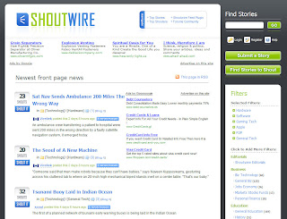
One of the nicer and cleaner looking sites of the bunch, Shoutwire doesn't hide its purpose for a second. You get your news, search, login, submit button, and categories right on the front page, all clearly visible, which makes it probably the most usable site out-of-the-box, if you will. The comments for the stories (together with the map, which I'll cover in features) are also easy to read. If I were pressed to find a flaw, I can only say that it might not stand out of the crowd enough (it looks a bit too much like all the other Pligg sites). Unfortunately, quite prominent AdSense ads and the fact that there's a whole entirely empty column on the right bottom part of the page take another point from the otherwise great design.

Grade: 8

b) Features

Remember the categories as filters feature that Care2 has? Shoutwire has it also. Unfortunately, there are some problems with them. Everything is fine until you try to subscribe to an RSS feed for a category - it doesn't work, you get the regular non-categorized front page news. Search is also quite lacking, it doesn't search the actual URLs of the submitted sites. Another feature is the fact that the links open with a frame from which you can vote on the site - a feature quite common as Reddit and Netscape also have it. But the most original feature is the Shoutwire map. Click on the number of comments on any story, and you'll see the comments for the story, but also a Google Map which shows the location of people who voted on the story. It's not really an essential feature, but it adds to the fun of browsing the site. In conclusion, Shoutwire has some nice options, but not enough to actually set itself apart from the others in this department; and some options are clearly lacking.

Grade: 6

c) Quality of content

The content on Shoutwire is good. The site doesn't break any records in amount of stories or in speed in which new stories show up, but there's also a limited amount of spam. The categories and the filtering capabilities are making Shoutwire a joy to use - if only I could find a way to have them in RSS. The site perhaps lacks a few dedicated fanatics who would push some really fresh stories, which would make the site a bit more authoritative, but it might also be a popularity thing which will come in time. *exploring Shoutwire further, after I've finished the article, I've discovered that it wasn't just a bad day for them as I've initially thought - the stories are actually much older than one would expect from a news site, ranging from 2-3 days, even on the front page. I had no choice but to lower the grade for the content from 7 to 5. I apologize for not being thorough enough in my research in the first place.

Grade: 5


And now, the final scores:


Care2 - 6 + 8 + 8 = 22
Digg - 9 + 8 + 5 = 22
Netscape - 7 + 8 + 9 = 24
Reddit - 8 + 7 + 7 = 22
Shoutwire - 8 + 6 + 5 = 19


Although the scores are similar, they are very revealing, as different sites amass their points in different areas. This means that there's no perfect community news site yet, and that - however advanced - all of these sites still have a long way to go ahead of them.

If you just scrolled here to see the grades, without reading the text, then the grades will be meaningless. Each service has its own quirks peculiarities, pluses and minuses, and the final grades can only be a pointer of the overall quality of the site. For example, someone who falls in love with Digg Swarm will probably sorely lack the feature on other sites, although it's by no means essential. Someone who prefers the minimal looks of Reddit will find a hard time switching to Care2, while users used to MySpace will love Care2's personal profile page which none of the other sites have. This text should make the decision easier, but you must try the services yourself and see how you like them. And if none of the above fit your needs, wait for next week, when I'll make a writeup of 5 most promising community news sites.

Labels: , , , ,


Read entire post! | Digg! | Reddit! | del.icio.us! | Stumble!